Badass Is The New Black (Season 4) Episode #8- Designing Your Website To Convert with Claire VanBemmelen
Apr 06, 2022
Is the design of your website turning people away before they even read anything? Last week we discussed the importance of good copy, but this week we are going to talk about designing your site so that people actually stick around to read your copy! I am interviewing my sister, business partner and design expert, Claire VanBemmelen to get her best tips for website design!
Watch the episode here:
Listen to the podcast here:
Designing Your Website to Convert with Claire VanBemmelen
Claire and I have been in business together for a long time and our partnership works well because we balance each other our. Claire says I am "the macro" and she is "the micro." I am the idea person, the big picture person and she is all about the details, the design, how to make it happen. It has worked really well for us and I am excited to be interviewing her this week and getting her best tips for website design.

You Have Six Seconds
One of my favorite things that Claire says is that you could have the best copy in the world but if your site isn't aesthetically pleasing, if it overwhelms them then they won't stick around to read your copy! She says you have about six seconds to make a good impression, to get them interested, or they are going to leave. So how are you going to connect with them so quickly? It's not just about the words on the page, you need to appeal to them visually and your website needs to connect with them emotionally as well.
Claire says to start by asking yourself how you want to show up for your audience. Obviously we have to start by knowing who our audience is and getting really clear on that. This is something we do in great detail with our students in the Digital Duplication Academy. From there, we can really zero in on how we want people to feel when they are on our site. What is your brand identity? What kind of vibe do you want to have? I always recommend to our students that they start with power words. Choose 4 or 5 power words that really describe your brand and use that to choose images, fonts and colors for your site. Is your brand playful, energetic and fun? Then I would expect to see bright, happy colors and more casual fonts. Is your brand sophisticated, elegant and professional? Then I would expect that to be reflected in your design choices!
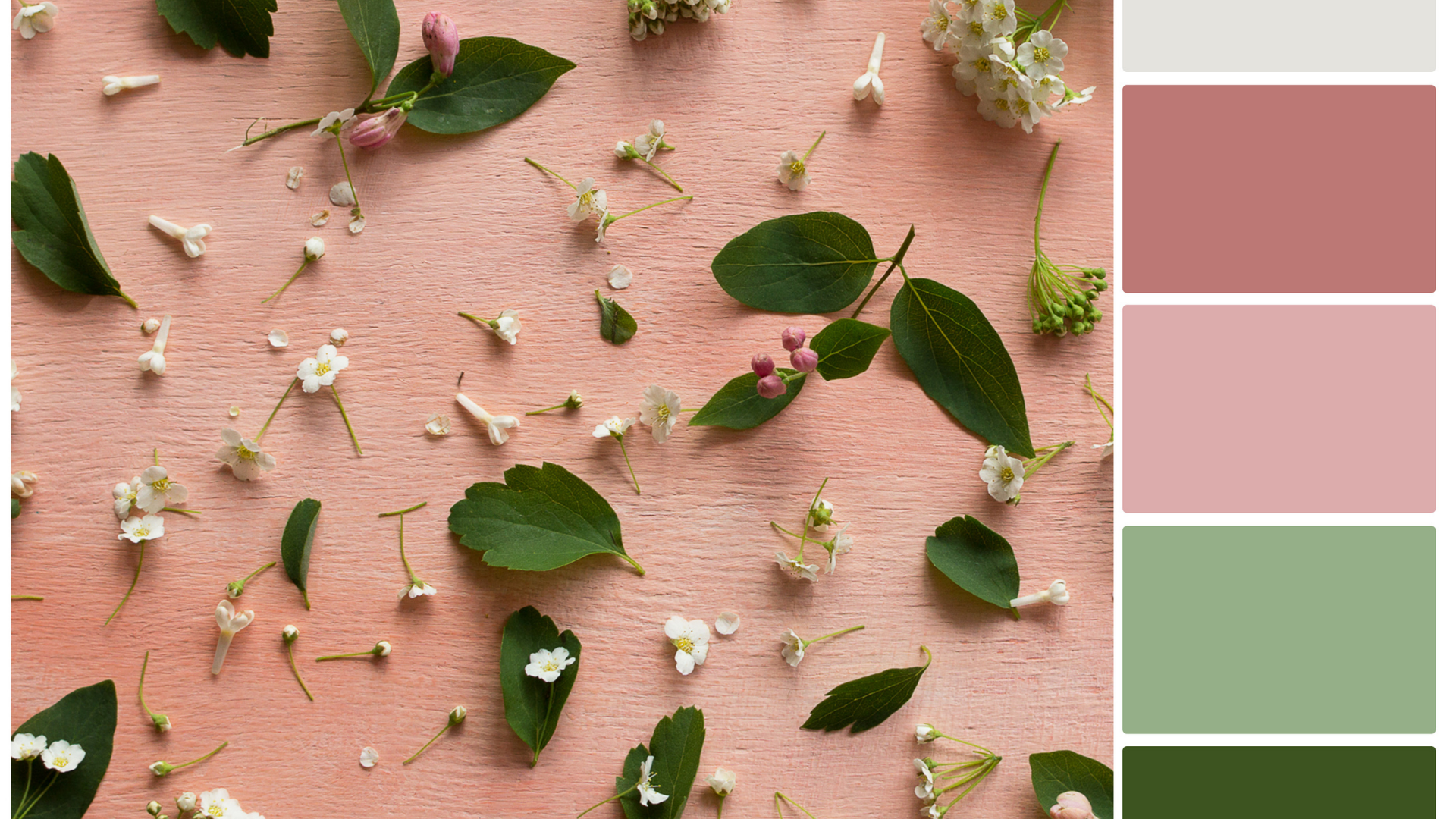
How to Choose Your Color Palette
Choosing a color palette is one area that can be really tricky for people who don't have a background in design. Often we choose colors that are too bold and bright and then overwhelm our audience when we design our website. There is a right and a wrong way to use bold colors in your design. Claire recommends that you start by choosing an inspiration photo. You can create a library of images that speak to you with colors that you love and then look for patterns. Are you choosing photos that have a lot of the same kinds of colors? Maybe it's a landscape or a city scene, what is it about that photo that you love?
I personally look to my closet for inspiration. If you are like me, a lot of your clothes tend to be the same colors because those are the colors that you are most drawn to. I used my fashion choices to inspire my color palette for my website and that worked really well for me.
Claire recommends that once you know what types of colors you like, and you have a photo inspiration, try to choose maybe one or two bolder colors and the rest should be neutrals. In some cases, it can help to be monochromatic and just stick with one color family. When you don't have a background in design, it is best to keep it as simple as you can to start.
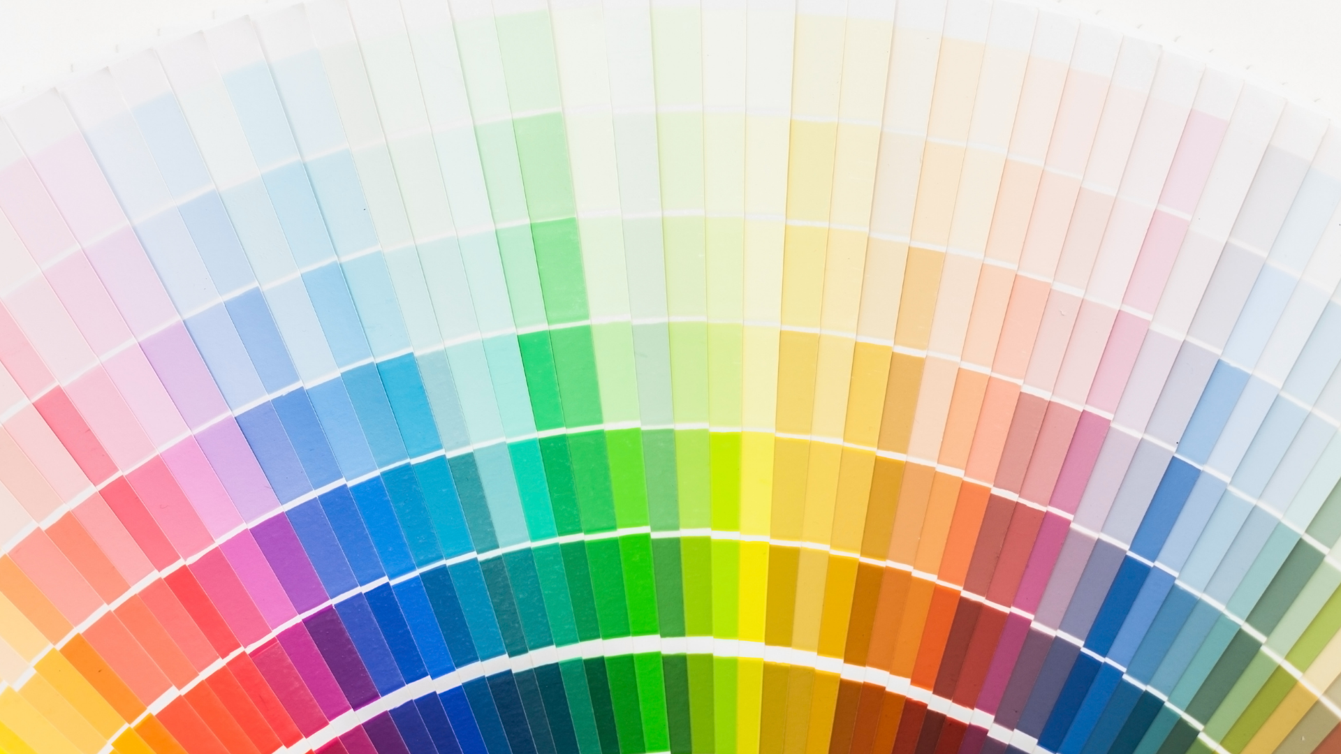
How to Use Color On Your Website
Once you have your palette chosen, you can focus on how to use those colors in your design. One mistake we see often with our students in the Digital Duplication Academy is that they use those bolder colors too often as a background color. You want to think about how your audience is going to move through your website. If they are going from section to section and it's a pink background, then a purple one, then blue, it can be too much for the eye.
You want to give your eye a rest as you move through the website. Choose background colors that are neutrals, then break that up with white backgrounds, and add in textures as well that have neutral tones like a washed out wood grain or a fabric texture or paper texture. Then you can have pops of color in your buttons, your headline color or you images and accents. You can use those bold colors as backgrounds but do it sparingly, and make sure that your text is easy to read still.
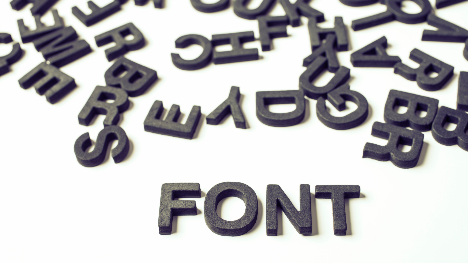
Choosing Fonts For Your Website
When choosing fonts for your site, you want to consider not only your brand identity and how you want to show up to your audience, but also how easy the fonts are to read. You might find a really fun cursive font that looks really pretty, but if you type a whole sentence out using it, then you might discover that it's really hard to read.
Claire explains that when we are putting together the different sections on a web page, we need to consider that each section has four parts. A clear header, bullet points, a transition (this is what I'm going to do for you) and then a call to action (this is what you are going to do in order to gain those benefits from me). So we recommend that you choose three fonts for your website. A headline font, an accent font and a body font.
When choosing fonts you want to keep a few things in mind. Can you read the font? Have you chosen one that is more bold and one that is thinner and more simple? Are you able to have both upper and lower case with these fonts? Can you bold them and italicize them? You will be using those features to format and highlight your copy so it's important to check that your fonts let you do those things.
You also want to consider font color. We had chosen a grey font for our Digital Duplication Academy and we started to get feedback from our students, who were mostly older people, that they were finding it hard to read. You need to consider your audience as well and what they need in order to be able to read your copy! Be careful when using color in your fonts. You don't want to make it too busy either as this will make it harder for your audience to read. Either have it all the same color like black, or have an accent color to make certain words or statements stand out.

Using Animation
One last tip that Claire gave us is to use animation on your page. Strategically using animations on certain page elements can help draw your audience's attention to the right things and keep them interested. However, just like with color and fonts, don't overdo it or use so many animations that it becomes distracting.
I want to thank Claire for taking the time to share these awesome tips with us. If you haven't had a chance to see last week's episode on Copywriting, make sure you catch it because it is also full of tips to help you attract the right people to your website.
If you want to learn more about design and how to create a beautiful website even if you don't know anything about tech, then you need to make sure you register for our upcoming FREE Masterclass!
How to Build a Wildly Profitable Website Without Knowing a Thing About Tech
April 12 at 8pm EST
Free MasterClass: Register now!!
Important Links:
Browse More Podcast Episodes!
Check out our most popular Masterclass,
"How to Automate Your Business and Increase Sales While You Sleep"
Get Instant Access!
We hate SPAM. We will never sell your information, for any reason.